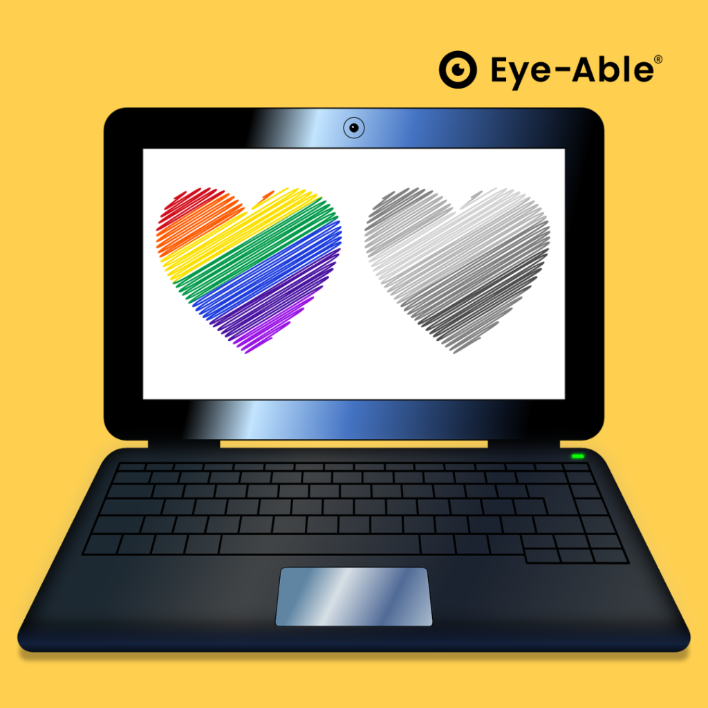
As far as accessible web design is concerned, a lot still needs to be done: 70% of all websites on the Internet are not accessible accessible and thus exclude many people excluded. There can be various reasons for this. One of them may be that the respective contents of a page is not visually are not visually inclusive. However, it is crucial to bear in mind that not all users colors and contrasts can perceive colors and contrasts in the same way. One must look at your own website through different eyes. What advantages accessible web design can have for you in terms of colorblindness and what you need to look out for.must be taken into accountin this article.
Color blindness encompasses several conditions, including monochromasia (inability to see colors), tritanopia (inability to distinguish blue and yellow), deuteranopia (inability to see green) and protanopia (inability to distinguish red).
What does web accessibility mean for color blindness?
Web accessibility for Color blindness means designing your website so that it can be understood and used by people who cannot fully distinguish colors. Dt includes factors such as e.g. contrast uand text size. In order to meet accessibility standards, websites are designed using the Web Content Accessibility Guidelines (WCAG) measured, which minimum contrast ratios, color definitions and more.
Color accessibility on websites offers several advantages
- Ethical responsibility: It is a commitment to creating a digital world in which everyone has equal access to information and services, regardless of ability.
- Legal compliance: Non-compliance with accessibility standards can lead to legal issues, such as lawsuits and financial penalties. Ensuring that your website accommodates colorblindness and other disabilities is a proactive approach.
- Improved user experience: Accessibility standards benefit all users. Complex and unclear color usage can be frustrating for everyone and lead to higher bounce rates.
Fact: In a study on accessibility in 2021, 86% of the top 1 million websites did not meet the minimum websites did not meet the minimum color contrast ratio requirements.
Elements that may not be accessible to colorblind users:
- Elements with low contrast: Poor contrast can make images, videos and other visual elements difficult to distinguish for people with limited color perception.
- Readability of texts: The choice of font, font style, font size and spacing can affect the legibility of text.
- Text overlays on images: Superimposed text on images can compete with the image content and make reading more difficult.
- In-text hyperlinks: Links must be clearly visible beyond the color, as some users may not notice color changes when hovering over links.
- Placeholder texts in forms: Text in form fields should have sufficient contrast to make it clear that it is input text.
The high number of non-accessible websites highlights the urgency of making accessible web content accessible for people with color blindness. The need goes beyond an ethical obligation and includes legal compliance and the fundamental improvement of the user experience for all. So: keep your eyes open in web design!


